
![]()

One of my goals for 2017 was to revamp my business site, and I’m happy to report that I’ve already done so. I finished the upgrades a few weeks ago, and the transformation is unreal.

I probably don’t have to tell you that the new one is on the right. Here’s my about page. See the difference?

All of the new pages have multiple levels of content that are unlocked (yes, just like a video game) as you scroll. For the full effect, check it out for yourself.
How Did I Do It?
This was not done in a day, though I did pound out the bulk of the changes within 48 hours because I didn’t want the site inoperable for too long. Let me walk you step by step through the entire process. These steps apply whether you’re upgrading an old site or creating a new one.
Step One: Create a Gameplan
Before I did anything, I pulled out the journal I’ve designated for all things PurpleInkPen and wrote out some goals and strategies. I knew I wanted to narrow my niche (this was also part of my 2017 goals), so I started by creating lists of genres I liked best in both fiction and nonfiction categories. I also went ahead and deleted the portion of my website that dealt with web proofreading and had nothing to do with manuscripts.
Next, I creeped on the websites of some freelancers I admire. I quickly realized I needed some sort of slogan to encapsulate my business. Something that would instantly let visitors know what I could do for them, and also make them say, “Hey, yeah, I totally need/want that!” I brainstormed a long list of ideas in my journal and eventually settled on “Manuscript Editing and Ghostwriting Services for Authors Who Want to Win More Readers.” That slogan lets people know what I do, why I do it, and how it can help them, all in one sentence.
Lastly, I made a list of everything I needed, aka a new logo, new images, a new theme, and new content that would focus on what I can do for the client and why I’m right for the job.
Step Two: A Rockin’ Theme
I pay for my hosting and domain name and all that good jazz for my site, but I didn’t invest in a paid theme the first go-round. But the themes that came free with WordPress.org didn’t suit my needs. So, I selected the most basic one and recruited my husband to help me figure out html and customize it. I basically just used a bunch of widgets, and the result was workable but not very classy, as you can see from above.
So, I did some research and found out that one of the freelancers I really like and who I mention quite a bit on this blog, Jorden Roper, used the Divi theme for her business site and her blog. So, with a quick Google search, I found out Divi was part of the Elegant Themes family. Elegant Themes offers 87 professional and highly customizable themes through a single subscription. You pay one price to get access to all of their themes and plugins. Their Divi Builder plugin is a heaven-send if you are anything like me and have trouble visualizing what your site will look like while trying to customize things in your dashboard. The Divi Builder actually allows you to customize absolutely everything while looking directly at the final product. You can drag and drop things around the screen. You can add new elements with one click. You can type out a paragraph and customize the font, size, and color right on the page. You can see everything happen in real time and know exactly how your site will look without ever having to hit a “Preview” button. Want to see exactly what I mean? Go check out the tutorial video. Go on … I’ll wait.
Tell me you didn’t just drool a little bit (just me? Hmm). You can even play around with it before ever buying with the hands-on demo they offer.
Now, don’t make the same mistake I did. The Divi theme and the Divi Builder are two different things. Divi is a theme, aka a customizable layout. Divi Builder is a plugin. I thought they were one and the same, so I at first only bought the Personal package, which just includes access to all 87 themes for $69. But I instantly became frustrated after applying the Divi theme because I couldn’t figure out how the hell to do all the cool things I’d played around with in the demo. Upon further inspection, I realized that Divi and the Divi Builder weren’t the same. To get access to plugins, including Divi Builder, you must buy the Developer package for $89. I had to upgrade, but I could have gotten the Developer package for cheaper if I’d signed up with that package from the start because the company was and still is offering a 10% discount to celebrate the new version of the Divi Builder’s release. You can still get that discount by clicking on the offer that pops up in the bottom lefthand corner of this page. I’m not sure how long that discount will be available, though.
Now don’t get me wrong, the Divi theme is very nice. It’s clean, beautiful, professional, and very user-friendly, which is always important for a business site. But the Builder is what you really want. I used the Divi theme for my site, but you can actually use the Divi Builder plugin to customize any theme, so don’t feel like you’re limited to Divi if you prefer another layout. Elegant gives you lots to choose from.
There is a tad bit of a learning curve, but really once you get your first page completed, you’ve already got it down. You also get access to tons of tutorials from the company when you purchase, which helped me out a few times when I got confused. If you’re starting your site from scratch, you have an advantage. My biggest issue when switching to this theme and the Builder was making sure I didn’t lose my old content while trying to get the hang of everything. The main issue was that most of my content was in widgets, not actually on the page, so when I activated the basic Builder layouts, it didn’t transfer the old content because all it actually saw was a blank page, and it got rid of the widgets because they weren’t part of the pre-made layout. I ended up just copying and pasting everything from the old site into a Word doc so that I didn’t have to worry and could just play around freely.
One of the layouts available was a “Coming Soon” page, so I made that my homepage while I was working on the site. I set up all my secondary pages first, then created the homepage last when I knew exactly what I was doing.
I really don’t know why I didn’t feel like it was worth it to dish out a little extra money to buy a good theme from the start. Having a visually appealing site that tells clients you invest in your business and that you’re serious about what you do is definitely worth the extra money. And we aren’t even talking $100 here! Seriously, who would you be more willing to pay professional rates to?
Someone whose price page looks like this:
Or someone whose price page looks like this:

Yeah … I’ll just leave you with that visual.
Step Three: Create a Logo
When I first created my site, I didn’t create a true logo. I purchased an image of a quill pen with a purple feather base and then created a super simple header image for my site with it. But that just doesn’t cut it if you want to look like an A-lister. You need to brand yourself. You need to look official. You need a real logo that can go on all of your business correspondence.
My initial plan for the reboot was to hire a professional to create the logo, and I may still do that, but I ended up being pretty happy with the logo I made myself.
I used Canva.com, which is the program I use to create all of my blog images. It’s completely free and super easy to use. Just like the Divi Builder, it’s a drag and drop system, and everything is pretty much self-explanatory. Or at least it’s a lot easier than InDesign or Illustrator, which I used back in college for my intro-level design classes. There are in-program purchases you can make. Canva has a wide array of images, vectors, and illustrations that you can insert into your image. They have a good selection of free images/elements, but the super fancy ones cost $1 each. You can work up your design with these elements and then you pay for all of the extra ones when you go to download the image. I created my logo for $1. The only thing I paid for was that feather illustration. There were free feathers to choose from, but I fell in love with that one.
Step Four: Quality Images
I had a total of two images on my old site: that arc of flying books on the homepage (which I still incorporated on the new website because I think it’s super cool) and my headshot on the about page. Aaaanndd my website was super dull.
I have images on pretty much every page now.They aren’t random images either; they tie into what I do. My portfolio uses images now, too. Instead of just a long, boring list of text outlining each of my projects, every project has an image placeholder that visitors can click, which then leads them to a page detailing that project.
The Divi Builder lets you incorporate visual elements, as well. You can create “blurbs” that link to various parts of your site. For instance, the blurbs on my homepage look like this.

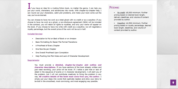
You can also add visual elements like the price boxes you see on my prices page above. Images break up text and make the site more inviting to visitors.
I also got new headshots and inserted them on my about page and contact page. You can also find some shots from that photoshoot on this blog on my about page and gravatar profile. My husband did a pretty good job with my old headshot, especially considering it was taken in our first tiny and somewhat dingy apartment. Still, this time around I wanted to hire a professional. Luckily for me, my best friend since childhood is a talented photographer, and she gave me a 50% discount. Woot woot! You can connect with her on Facebook and Twitter if you live in the Middle Tennessee area.
Step Five: Client-Oriented Content
I didn’t fail in this aspect with my old site, by any means, but I definitely took it up a notch during the reboot. You must remember that your site is not for you, not really. Who’s going to be looking at it? Who has to figure out how to navigate it? Clients. Your website should be about them, not you. Now, yes, you have to prove that you can actually help them, but even your about page should focus on the reader, not the writer.
Your homepage should display a slogan that tells potential clients why they need you. It must also tell them exactly what you can do and link them to more information regarding your services. You’ll notice that I have little slogans under each of my service blurbs above. Those are fast, easy ways for visitors to figure out which of my services might appeal to them, then allows them easy access to the pages of my site that provide all the heavy details about those services.
My homepage and price pages were always client driven, but my about page needed some work. It basically was just a list of my credentials and some details about my life and interests. It wasn’t terrible; it worked to prove that I could actually do the things I was advertising, but it was pretty boring for a client. People are all egomaniacs at heart. The centerpiece of my about page is now a list of reasons clients need my services. That list tells them why they ought to hire a ghostwriter or copy editor, how doing so can contribute to their manuscript’s success. Then, under that, I insert the personable stuff about why I do what I do and what qualifications I have that make me a good fit. Because that’s important too. After you’ve convinced your audience that they need your services, you must convince them why they need you and you alone to do provide those services. Credentials are great and should always be included, but why you do what you do is more important.
Final Thoughts
Your website is your biggest selling tool. Sure, more people may find you through social media at first, but social media isn’t going to tell interested readers everything they need to know. They’re going to click on your site (if you don’t have a link to your site on all your social media, you better get on that asap), and that is what will make or break their decision to get in touch with you. When you send out pitches and link to your portfolio, you’re going to get more yeses if your site hits all the marks.
Don’t be a cheapskate like I was in the beginning. Yes, making a good site costs money, but we aren’t talking a massive chunk of change here. You just need a few things, many of which are free.
Here are All the Tools I Used to Create My Website:
-
- Hosting: Siteground $95–you can read a little more about why I chose this host.
- Software: WordPress.org (not .com)–free with hosting
- A Good Theme: Elegant Themes Developer Package $89
- Logo: Canva–free but includes in-program purchases
- Images: Pixabay (free, uncopyrighted images) and someone to do your headshot (I paid $75)
That’s under $300. If you’re truly broke (no shame in that; we’ve all been there), you can divide those expenses up by month. Get that hosting first and download WordPress.org. Get to work just getting something out there using one of the free themes. Make that free logo on Canva. Then, when you’ve gotten a paycheck or two through your pitching, invest in a good theme. A month or two later, hire a photographer or just someone you know who’s good with a camera. Later on down the road, you may want an updated logo done by a professional.
My point is that it’s totally manageable, and it isn’t going to put you out on the street. You can do this! Invest in your business, and you will see returns.

Very helpful! I’ll keep these tips in mind for the future. Thank you!
Yay! Thanks for stopping by.